View Organization dashboards
Astro provides dashboards that share important metrics about your Organization's use of Astro, which you can use to manage Deployments and resources. These dashboards include:
- Organization Overview
- Deployment Detail
- DAG Run Details
- Cost Breakdown (Hosted only)
- Operator Use
Organization dashboards help you quickly identify opportunities to optimize how your team uses Airflow at different organizational levels, such as across your Organization, within Workspaces, in specific Deployments, and operators within DAGs. For example, you can use the Organization Overview or Deployment Detail dashboard to identify unexpected activity, without requiring you to examine the DAGs results in the Airflow UI. Instead, you can quickly check your dashboards to identify trends like unusually high or low rates of task successes, and then check the Cost Breakdown dashboard to identify any associated costs incurred by that behavior.
Watch the Astro Academy Reporting Learning Byte video to learn more about how observe your teams' Airflow Deployments.
To view Organization dashboards, click Dashboards in the Organization section of the Astro UI menu. You can also access this page directly at https://cloud.astronomer.io/dashboards. In addition to viewing the dashboards in the Astro UI, you can also export and email individual reports.
Use the tabs at the bottom of the Astro UI to switch between dashboards. Each dashboard shows the last time that it was updated in the Data available through section.
Only users with Organization Billing Admin user permissions can access Organization dashboards.
Organization overview
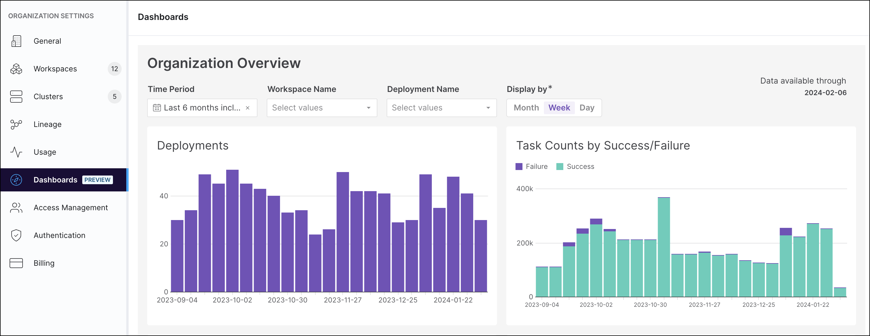
The Organization Overview dashboard provides at-a-glance summaries about activity across your Organization's Deployments. You can also filter to view summaries for specific Workspaces or Deployments.
This dashboard allows you to compare the activity and performances of Deployments to one another. You can identify Deployments, DAGs, or tasks that have had recent behavior changes or are performing in an unexpected way. For example, you can filter the data shown by time period, Workspace name, or Deployment name, to view data such as the number of successful or failed tasks within Workspaces or Deployments. Hovering your cursor over any of the charts brings up a detailed view of the data, indexed by date.
By examining your data at the Organization level, you can identify Deployments with large numbers of failing tasks by looking at the graphs or charts for outliers. Then, you can filter by time period to see if there have been similar events in the past and when.

Deployment Detail
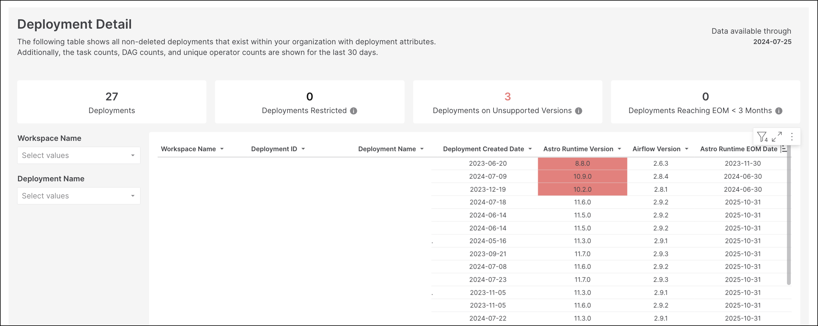
The Deployment Detail dashboard shows a table of all Deployments in your Organization, indexed by Workspace name. For each Deployment, the dashboard shows your Deployment configurations as well as use metrics like task run counts, DAG run counts, and operator counts.
Use this dashboard to check that your Deployment has the appropriate resources based on the number of DAGs it runs. You can also use this dashboard to check whether a Deployment's Astro Runtime version is currently supported.

DAG run detail
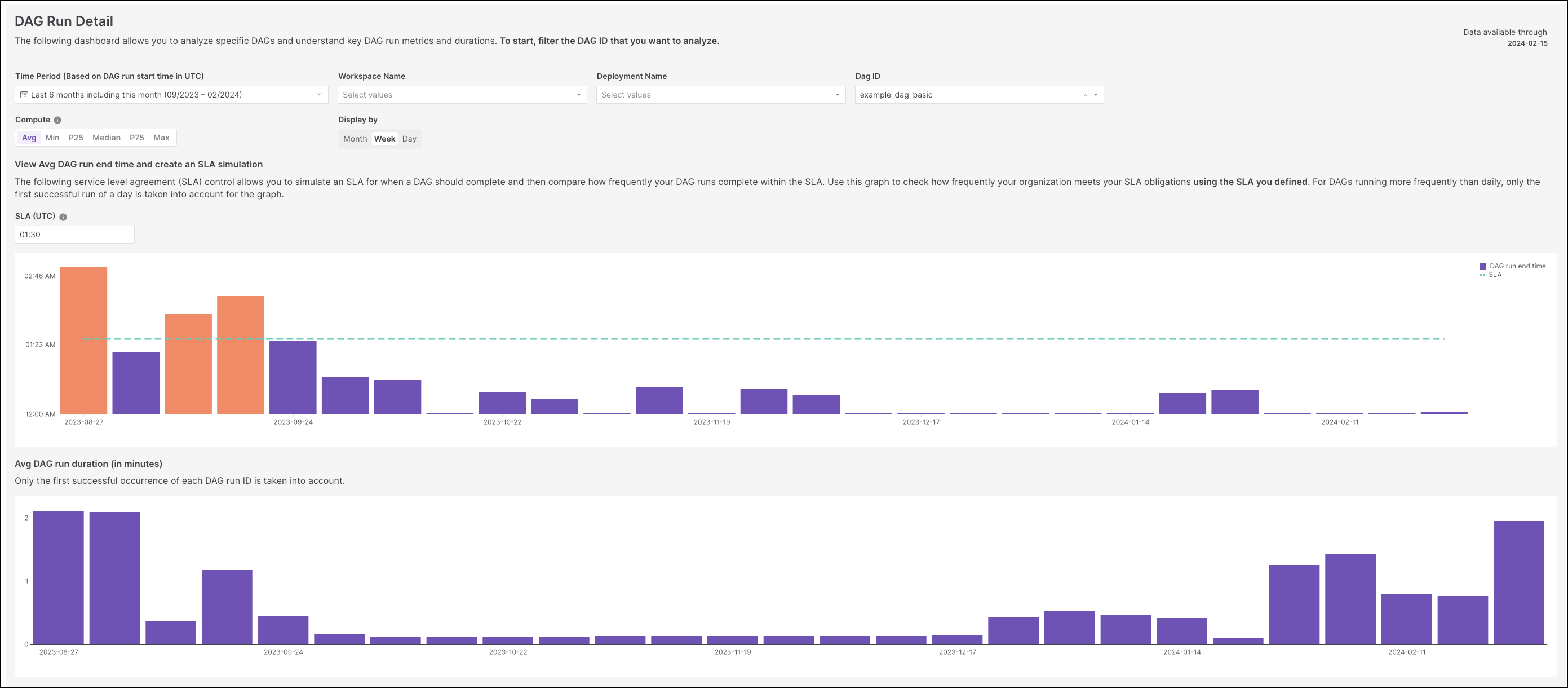
This dashboard shows the average and median ending time of a specific DAG run, aggregated by a chosen time period, month, week or day. You can use this view to visually inspect when particular DAGs complete their first run, which allows you to see trends over time. Check this dashboard when you make changes to Deployment resources or DAG code to track their effects on performance over time.
You can also use this dashboard to simulate a service level agreement (SLA) for when a DAG should complete, and then compare how frequently your DAG runs complete within the SLA.
The report only includes the first successful occurrence of each DAG Run ID. Manual DAG runs and sub-daily DAGs are excluded.

Create an SLA simulation
Use this view to check how frequently your Organization meets your SLA obligations, or to identify if specific SLAs are breached.
To simulate an SLA, you must first define an SLA and then apply it to specific DAGs.
- Select the Time Period over which you want to look at the DAG run data.
- Choose the DAG ID that you want to check DAG run completion times for. If you have a large number of DAGs in your Organization, you can first filter by Workspace Name and Deployment Name before choosing your DAG ID.
- In the Compute section, choose the method that the dashboard uses to summarize your DAG run end times. For example, if you select Median, the dashboard shows the medium DAG run end time for each time interval.
- In the Display by section, choose whether you want to aggregate the data by Month, Week, or Day. The default is Week.
- Specify the SLA Time (UTC) to compare with your DAG run end times.
The report generates two graphs. The first shows your summarized DAG Run End Times compared to the SLA time you defined. The second chart shows a summary of the same DAG runs, but charts their run time using duration instead of end time.
Cost Breakdown
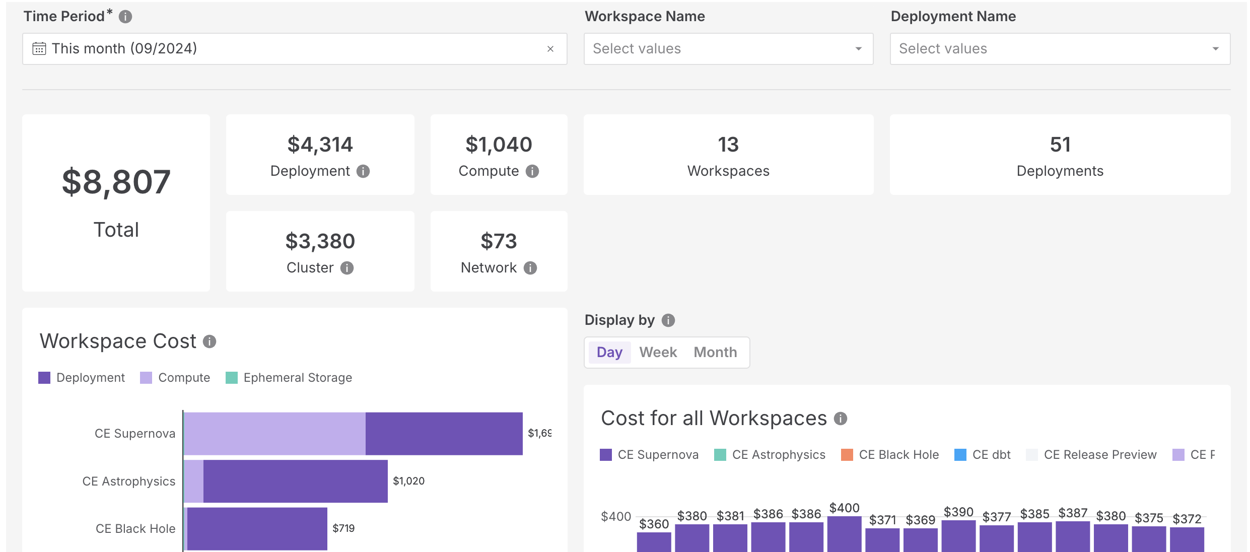
In the Cost Breakdown dashboard, you can find detailed information about how much you spend on Astro over time for each of your Workspaces and Deployments. Use this data alongside your other dashboards to identify the biggest opportunities for cost reduction in your Organization.

Operator use
The Operator Use dashboard shows how your Deployments and Workspaces use Operators, as well as how often tasks succeed and fail when using specific operators. Use this data to identify types of operators that could be replaced with more efficient alternatives, or to find operators that fail more than expected. This dashboard provides data to answer the questions, What are the top operators used across my organization? and Which workspace is using the selected operators the most?.

